
Consumer research to redevelop proposition for School Fee Plan
School Fee Plan is a funding service for private school fees. We undertook research with parents to better understand customer need and evolve the service proposition.


This is RFPs made better. Award-winning investment consultancy firm, bfinance asked us to design a best-in-class RFP procurement service and portal.

How many times have you done an RFP and cursed the online submission portal? Typically RFP portals are a challenge to use - IT-led development, non-intuitive conventions, generally bad UX. bfinance wanted to change all this with their new online proposition. Their internal team had developed an initial prototype and asked Pancentric to take stock of user testing insights and make UX/UI recommendations.
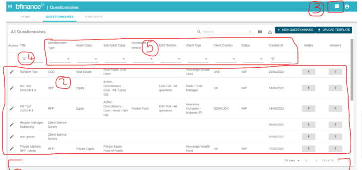
bfinance runs a large number of procurements each year - each entails extensive due diligence. RFP question sets are long (up to 400 questions), made additionally complex by a 2-stage assessment and selection process, multiple stakeholders on the user side, short and long form questions, numerical data collection and document uploads. The initial prototype helped highlight key UX challenges, most notably around task orientation. Previous offline processes had also influenced some design decisions.
Above: Initial prototype, before Pancentric's involvement.
Key UX challenges were around Task Orientation.
Our shared design objective with bfinance was to make the RFP process as painless as possible - intuitive, frictionless; a digital experience that would demonstrate to the investment marketplace that bfinance was a good business to do business with. A business they wanted to do business with.
Simplification and feature prioritisation was key. What is useful and important to the user at each stage of the process? Connected features and functions?
Design was driven by Pancentric's proprietary UX criteria (also used in benchmarking service DigitalBar) covering Design Scheme, Task Orientation, Data Entry, Interactivity, Help & Error Tolerance. Specific areas of focus on the design project were as follows;
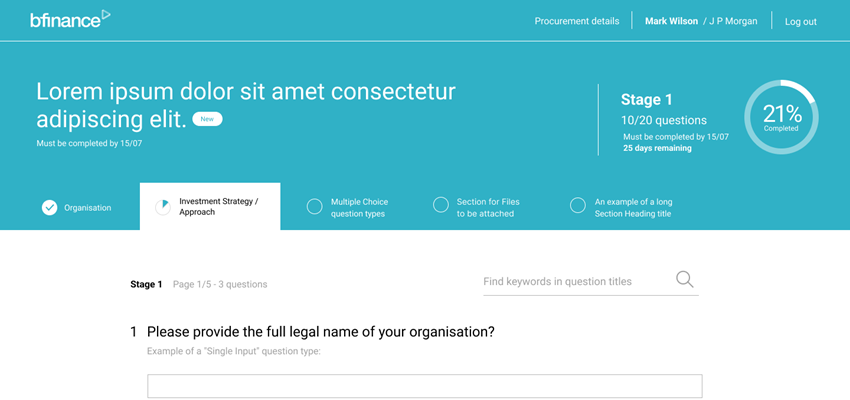
A range of concepts were wireframed and tested with dark and light blue UI variants. The dark variant is now in beta with increasing volumes of users being on-boarded.
Focus on information hierarchy, progress status, clustered utilities
Light blue UI variant - sticky header with long scroll reduction
Clear primary and secondary calls to actions
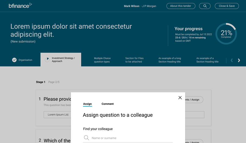
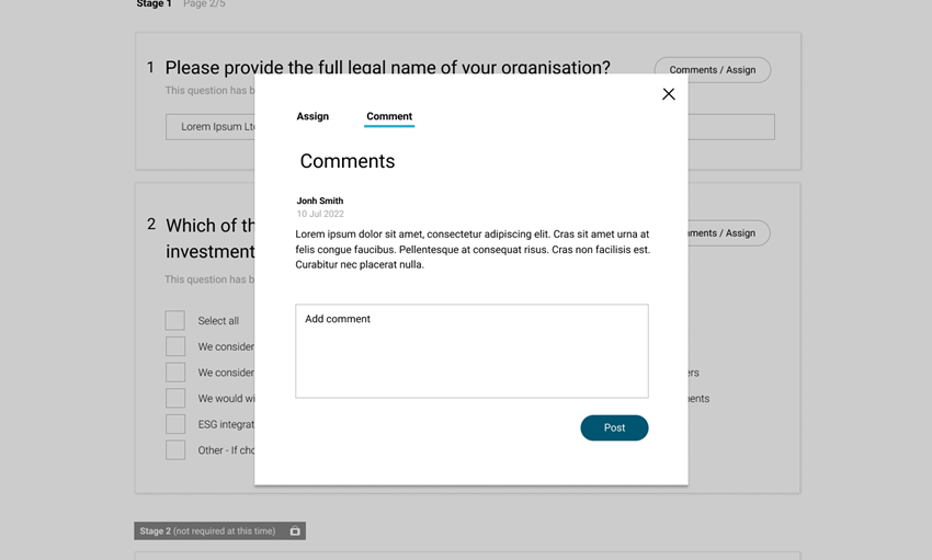
 Stakeholder collaboration - question comments and assign to colleagues
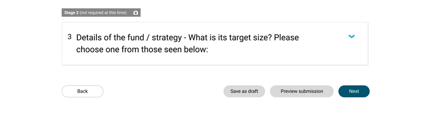
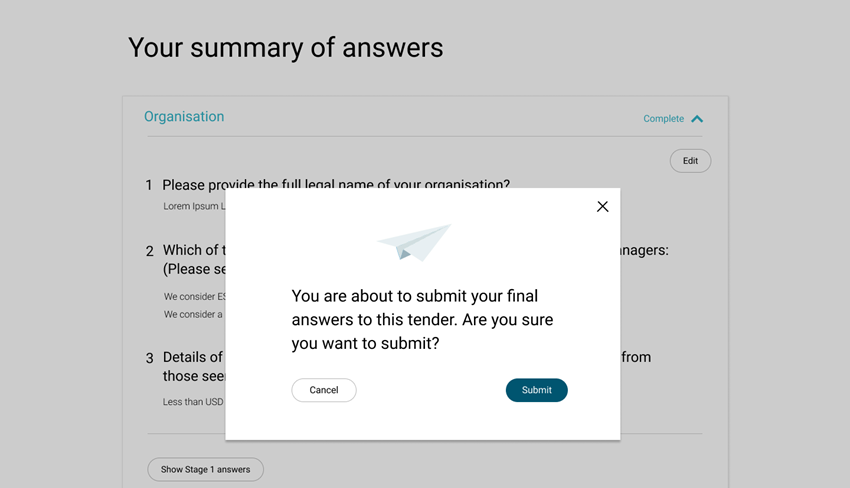
Save and continue features to reassure users
School Fee Plan is a funding service for private school fees. We undertook research with parents to better understand customer need and evolve the service proposition.

New corporate identity for Cardif Pinnacle - now Pinnacle Pet Group as a result of a new ownership structure with JAB Holdings and BNP Paribas

Vessel Protect is a digital-first MGA with big growth ambitions and a global outlook, and their start-up needed an fast, innovative Quote & Bind solution, which they found in our Go-Insur solution.