
Pancentric orchestrates modernised new look for Insurtech UK
New brand and website launched for trade association Insurtech UK, developed by Pancentric Digital and design partner Kohde


As digital evolves so must standards. From Autumn 2023, Pancentric's DigitalBar benchmarking service is introducing tougher UX scoring for Insurer brands.

DigitalBar is a specialist digital benchmarking service provided by Pancentric Digital and our partners Altus Consulting. It assesses the digital capabilities of over 200 UK Insurer brands across 8 General Insurance product areas, ranking and promoting excellence.
Yesterday's innovation is today's expectation.
Just when Insurer brands start to get the measure of a new digital capability the next innovation turns up and turns heads. It puts Insurer operations in constant flux. Brands do their best to adopt and operationalise new tech, adapt processes, repurpose teams, but the larger the ship, the more challenging it is to turn. Business casing continuously wrestles with the pros and cons of new tech investment.
UX trends are largely shaped by the tech of the day - the restrictions or flexibility of their formats. Adoption of those trends is driven by two main factors.
There are 3 million UX designers globally and all of them are at it, all of the time - iterating. Assessing each other's work online, recycling, adapting, combining, researching, challenging, tweaking, improving. It's a never-ending UX stress test. Over time, certain principles become accepted and commonplace, some conventions are used so extensively and consistently that they become design staples.
Occasionally, there's a shift. In 4 decades of UX/UI we've had a few shifts, almost always shaped by the dynamics of the prevailing tech. From the burger menu created by Norm Cox back in 1981. Three little lines now ubiquitous in mobile settings. To a world defined by Apple; skeuomorphism that mimicked real-world mental models. To trends like vertical scrolling popularised by mobile and spurred on by mouse wheels. To Google's Material Design which saw digital defining its own cues and terms. And so on.
There are few independent metrics of UX standards. Plenty of opinion, few definitive benchmarks where one Brand's online product journey can be compared usefully to another Brand's on the same terms. An apples to apples comparison.
And while there is no absolute right and wrong in UX - specific project context, research, professional judgement and user testing trumps all - there are principles and conventions born out of the worldwide effort of iteration that produces valid best practice.
DigitalBar was created to champion best practice, to encourage the sensible application of validated UX principles, and to celebrate good iteration and invention when we see it.
Change is constant so we must keep revisiting our UX scoring criteria.
The hallmark of a seasoned UX professional is knowing how to pick from our overflowing toolbox of UX methods and custom-make a design process for each project that doesn’t waste shareholders' money but gets the job done. 'Twas ever thus. Jacob Neilsen, 2023
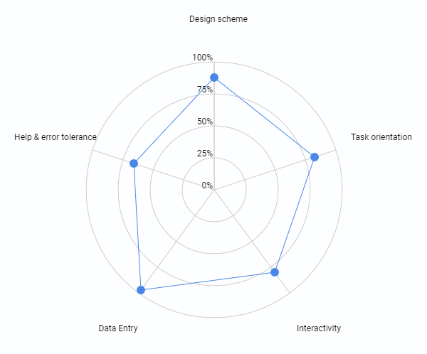
Our DigitalBar UX assessments feature approx. 50+ checks across 5 usability categories.
In previous years, each of these checks received a graded score of between 1 and 5, where 5 was good and 1 was poor. In 2023 we have changed a proportion of these checks from graded scoring to binary scoring. The binary scoring applies to areas of fundamental UX hygiene. Insurer Brands no longer get 'easy' points for getting the basics right.
From 2023, when a UX hygiene principle is satisfied the check is scored '+1'. If the principle is not satisfied, the check is scored '-1'. Where previously Brands could be awarded as much as '5' for satisfying a hygiene feature, the maximum they can now score is '1'. And they'll pick up a '-1' penalty if not satisfied.
Example binary scoring checks;
Example graded scoring checks;
Some changes have also been made to the weighting of the UX scoring categories.
Pancentric Digital provides a range of UX design and customer research services. To access our DigitalBar insurer benchmarking data visit the DigitalBar website.
New brand and website launched for trade association Insurtech UK, developed by Pancentric Digital and design partner Kohde
HUB Intranet has partnered with QBS, the largest channel-only online marketplace. QBS is the go-to software delivery platform for enterprises, providing a complete solution for long tail software procurement.

Building on recent award success and stand-out work in the specialty insurance space, Pancentric's Go-Insur policy admin solution has launched a brand building campaign in the City of London.